Warm or Cool: Picking a Palette by Contrast
Warm or cool colour palettes make more sense when you compare neighbouring hues. Learn how to judge the whole grouping and choose colours that work together.
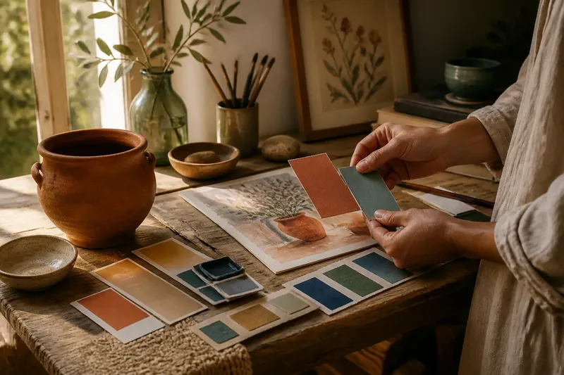
Warm or cool colour palettes are easiest to judge side by side, not by picking a favourite swatch from a fan deck. Put a terracotta chip beside a blue-green one and each will change how the other appears: the terracotta may seem more orange, while the blue-green looks sharper or colder. The useful question is not which hue is warm in isolation, but what contrast you want the group to create.
What makes a colour grouping feel warm or cool?
Warm colours tend towards yellow, orange and red; cool colours tend towards green, blue and violet. These are helpful directions, not fixed categories. A green with a yellow cast can feel warmer than a blue-green, while a red with a violet cast can seem cooler than an orange-red.
Temperature is also relational. A muted ochre can look warm beside slate blue, then seem subdued beside a brighter, more orange red. Compare several colours together on the same surface and in the same light. A single chip cannot show how its neighbours will influence it.
Keep three qualities in view as you compare:
- Hue: the colour family, such as red, green or blue.
- Value: how light or dark the colour appears.
- Chroma: how vivid or muted it looks.
Two colours may share a warm temperature but differ sharply in value or intensity. Those differences can make a palette feel lively, weighty or calm, even before you add another hue. For a fair comparison, use colours with roughly similar value and chroma first; then adjust those qualities deliberately.
When does a warm palette make sense?
A warm grouping suits a scheme that should feel close, earthy or animated. Rust, clay, ochre and warm brown sit naturally together, but repeating the same degree of redness can make the arrangement feel flat. A cooler neighbour, such as a softened blue-green, gives the warm colours a point of contrast without taking over.
Consider the materials and colours already present. A red-toned timber floor, a woven natural-fibre rug or a brick feature may provide a warm anchor. Instead of matching each one exactly, pick out a related hue and let a neighbouring colour offer a different temperature. This keeps the grouping connected without turning every surface into the same note.
Warm palettes often suit objects and settings where closeness is part of the intention: a reading corner, a display of ceramics, or a set of botanical illustrations with ochres and reds. If the colours start to crowd one another, reduce the number of vivid hues or bring in a quieter, cooler colour as a visual pause.
When is a cool palette the better choice?
Cool groupings are useful when you want a scheme to feel clear, restrained or spacious. Blue, blue-green, green and violet can create a gentle progression, especially when one hue is muted and another is clearer. They need not feel icy: a soft green and a smoky blue can sit quietly together, while a sharp turquoise changes the energy of the group.
Look for a warm accent if the cool colours seem disconnected or overly uniform. A small area of ochre, warm pink or natural wood can make the contrast legible. The accent does not need to cover much; its role is to give the cooler hues a neighbour that shifts their apparent temperature.
Cool palettes may suit a collection of glass, a blue-and-green illustration, or a room scheme built around greyed fabrics. Check that the darkest colour does not swallow the lighter ones. Adjust value as well as temperature: a pale blue beside a deep green reads differently from two mid-toned colours, even if both pairs share the same hue families.
How do you choose between warm, cool and mixed?
Start with the colour that must remain: a patterned textile, a favourite object, or an existing painted surface. Set it beside two or three possible neighbours, rather than trying to build a palette from a row of isolated chips. If the group lacks contrast, change the neighbour’s temperature, value or chroma—not all three at once.
Say you are choosing colours for a small illustration centred on a rust-coloured pot. You place it beside muted blue-green and warm ochre. If the pot looks too orange beside the ochre, you could swap the ochre for a cooler, quieter green; the expected result is a clearer distinction between the pot and its background. If the blue-green then feels too strong, mute it rather than replacing every colour. The decisions remain tied to the whole grouping.
Use this short comparison when you are stuck:
- Choose mostly warm if the anchor colour is warm and you want nearby hues to reinforce that character.
- Choose mostly cool if the anchor is cool and you want a restrained progression around it.
- Choose a mixed palette if you want one temperature to make the other stand out.
- Change value first if the colours blur together despite their different temperatures.
- Reduce chroma if several vivid neighbours compete for attention.
Lay the selected colours together in the proportions you expect to use. A palette of small swatches can suggest one balance, while a large field of the same colour may dominate the finished arrangement. For a design or room scheme, include a sample of the largest surface alongside smaller accents; judge the relationship in the approximate amounts planned, not as equal squares.
Which colour contrast questions come up most often?
Can a palette include both warm and cool colours?
Yes. A mixed palette can feel coherent when one temperature leads and the other provides contrast. Decide which colour should attract attention, then use its neighbours to support that role.
Why does the same swatch look warmer beside one colour?
Its neighbours change the comparison your eye makes. A blue beside a red can seem cooler than the same blue beside a violet, so assess the swatch in the grouping where it will actually appear.
Should I match the colours or contrast them?
Match them when you want a quieter transition between neighbouring hues; contrast them when you want a colour to stand apart. You can combine both approaches by keeping most colours related and using one contrasting neighbour.
What should I do if the palette still feels wrong?
Remove one colour and compare the remaining group before adding anything new. If the problem is that the colours merge, adjust value; if they compete, reduce chroma or replace the most discordant neighbour.
How can you judge a palette beyond the swatch?
Move the colour grouping where it will be seen, or place samples beside the material it needs to work with. A palette for a painted panel should be judged with the panel’s surrounding colours visible; one for a print should be viewed with its paper and frame in the composition. Keep the samples together rather than relying on memory between separate comparisons.
Natural and artificial light can change how colour relationships appear. Compare samples under the lighting relevant to the setting, and check again if the light source changes. Follow product labels and manufacturer instructions for paint and other materials, since their application and sample guidance can differ.
When choosing a warm or cool colour palette, make the decision about relationships: which hue leads, which neighbour sharpens it, and whether the contrast is strong enough for the effect you want. Keep the final group visible as you adjust it. That simple habit catches a mismatch that an appealing isolated swatch cannot reveal.